You are currently browsing the tag archive for the ‘United Colors of Benetton’ tag.

Front cover
COLORS magazine first fell onto my radar last year when reviewing Broomberg & Chanarin’s work. It cropped up again in March when I delved into Stefan Ruiz’s early career. All three were creative directors in COLORS continually rotating roster of aesthetic leadership.
Based in the north Italian town of Treviso, COLORS is part of the publishing activity of Fabrica, Benetton’s communication research centre. Benetton’s searing brand-making hit my young retinas with its controversial United Colours of Benetton (billboard) ad campaign of the early nineties.
Besides Saatchi and Saatchi, Benetton was the only time in my childhood I was aware of the names behind billboard products. That is an assumed level of cultural penetration, but I’m working from precious memory too much to determine its significance.
[As an aside, Enrico Bossan Head of Photography at Fabrica and Director of COLORS Magazine was co-curator for the 2011 New York Photo Festival. He also founded e-photoreview.com in 2010, which delivers without no-nonsense video interviews with photographers.]
The 50th edition of COLORS (June 2002) focused specifically on prisons. From the introduction:
With over eight million people held in penal institutions the prison population is one of the fastest growing communities in the world. In the United States, a country which holds 25% of the world’s prison population but only 5% of the world population, prisons are now the fastest growing category of housing in the country.
For COLORS 50 we have visited 14 prisons in 14 countries and asked a difficult question: Is it possible to rehabilitate a person back into society by excluding them from it? We spoke to murders, rapists, pedophiles, armed robbers, thieves, frauds, drug dealers, pick pockets, high-jackers and prison wardens. In most cases the stories we heard confirm one thing. That prison does not work. In COLORS 50 we ask the inmates themselves to suggest alternatives.
The magazine is 90 pages of portraits and interior landscapes. I came to this collection of work late (in my research here at Prison Photography) and in many ways it challenges many of my former presumptions. This edition is a precursor to the “VICE-aesthetic” celebrating the battered and broken, and I’d be happy to dismiss it if it weren’t for the long-form statements made by the prisoners, which are printed with care and without censorship.
The issue includes bodies of work by photographers I was previously unaware of including Juliana Stein, Vesselina Nikolaeva, James Mollison, Charlotte Oestervang, Suhaib Salem, Federica Palmarin, Mattia Zoppellaro, Ingvar Kenne, Kat Palasi, Dave Southwood, Gunnar Knechtel, Pieter van der Howen and Sye Williams. I will be featuring selections of these photographers over the next few weeks.
I bought the paper edition, but you don’t have to as the entire Prison/Prigione Issue 50 can be viewed online.
Above all, while browsing the images and stories of the magazine, I am really pressed into thinking about the ease with which a commentator can politicise and argue against the prison system in America, but be flummoxed when asked to appreciate prison systems elsewhere. Benetton uses the common theme of incarceration to raise questions, but I am at a loss to think of common answers to tackle the pain, blood and damage done to individuals in their lives before, during and after imprisonment.
At a surface level this is car-crash photography; a look inside worlds we’ll never know, but at its heart it is a call to think about the nature of humanity and to think about the capacity for humans to kill, to survive, to get addicted and to repair and to forgive.

Back cover
Adam Broomberg and Oliver Chanarin
‘Unconcerned but not Indifferent’ Foto8 (March 2008)

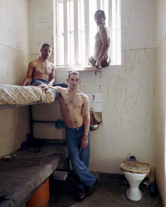
Timmy (center), with Peter (left) and Frederick, Pollsmoor Maximum Security Prison, South Africa (c-type print, 12" x 16", 2003)

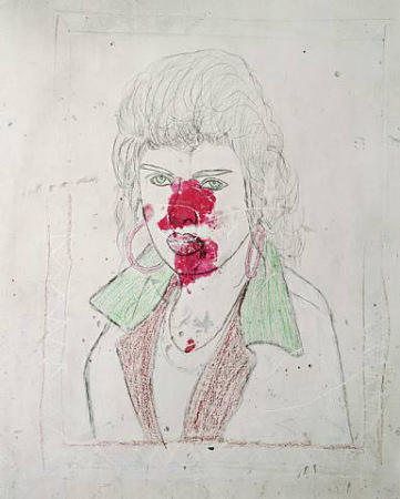
Dion, 41, General in the 28s describing his imaginary uniform, Pollsmoor Maximum Security Prison, South Africa (c-type print, 12" x 16", 2003)
If two ends of the spectrum were identified this week during the debate about race and how it is (mis)treated by photographic practice we could see them as the moronic fashion world practitioners and then everybody else – “everybody else” being social documentarians, new-media image-makers, old-school bang-bang-club photographers and fine art practitioners. This second larger group is where most thoughtful folk place their energies.
Bizarrely there are a couple of guys who run the length of this spectrum. Adam Broomberg and Oliver Chanarin used to be the creative directors of Benetton’s controversial Colors Magazine AND they travel through Africa and Central America taking photographs of people in institutions.
Broomberg and Chanarin have also pissed a lot of people off. They are that good.
We all remember Steven Mayes’s departure speech from the World Press Photo, but Broomberg and Chanarin beat him to his oft-repeated remarks that photographers repeat motifs and collectively thicken the pen around photojournalism’s self-drawn caricature.
A full year prior to Mayes’ rallying call for new imagery (genuine, everyday Black culture; affluent drug use and users; and real sex), Broomberg and Chanarin were throwing punches low and hard at photojournalism’s conceit. They quoted Brecht; ‘The tremendous development of photojournalism has contributed practically nothing to the revelation of the truth about conditions in this world. On the contrary photography, in the hands of the bourgeoisie, has become a terrible weapon against the truth.’
In turn, Broomberg and Chanarin relied on Sontag and Barthes;
‘Since its inception photojournalism has traded in images of human suffering. If one of its motivations for representing tragedy has been to change the world then it has been unsuccessful. Instead the profession has turned us into voyeurs, passively consuming these images, sharing in the moment without feeling implicated or responsible for what we are seeing. Roland Barthes summed up the analgesic effect of looking at images of horror when he wrote “someone has shuddered for us; reflected for us, judged for us; the photographer has left us nothing – except a simple right of intellectual acquiescence”.’
They provide a pat description of the “obscene feeling” jury process in which there is no text, caption or context. Judgement is dependent only on the aesthetics of the image: “We are asked to judge whether, for example, a photograph of a child suffocating to death in a mudslide is sufficiently beautiful to win a prize.” After this Broomberg and Chanarin explain the means by which the panel narrowed down the 81,000 images to five winners, suggesting with some contempt that Hetherington’s Exhausted Soldier was a predictable result.
Before I go any further, I should say that Tim Hetherington voiced a stirring rebuttal to Broomberg and Chanarin’s derision.

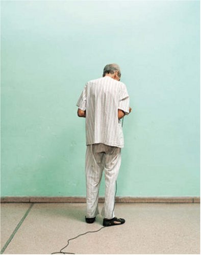
Self-Portrait by Mario, Ren Vallejo Psychiatric Hospital, Cuba. (c-type print 12" x 16", 2033)
So what? They’re a grumpy duo with a pocket full of common critical theory? Yes … and no. They go further. To my observations they apply what they preach. I have coined the term Slow Photography for this piece because they lug about a 4×5 camera and as well as standing over the top of their medium format to hold a conversation, they’ll usually stick around for a week or three.
They’ve described the relationships they build with their subjects as very important. Lucky for them they have the leisure to hang around you are saying?! Fair point, but they use their time well.
With Ghetto, they went to Pollsmoor Maximum Security Prison in South Africa and made portraits of male, female and transgendered inmates. They went to Ren Vallejo Psychiatric Hospital, Cuba also. In total they went to twelve rare communities, methodically photographing and asking the same questions: “Who is in power here? Where do you go to be alone, to make love, to be with friends? What are your hopes and dreams?”
I love that question, “Who’s in power here?”
Broomberg and Chanarin simultaneously reference old slower photo-processes and question the sped-up practices of 21st century photojournalism. Charlotte Cotton, Curator of Photographs at the V&A, has observed, “The sense of activity being slowed for the camera references nineteenth century photography both in terms of process and style. It also serves to detach their photographs from the conventions of photojournalism.”
And if we needed any more proof that these two geezers are on top of their game, lets look how they dealt with the two major conflicts of the beginning of the 21st century.
They got quiet with wartime scratches and scrawls, but have received none of the plaudits Peter Van Agtmael, Tim Hetherington, Roger Ballen or bubble chamber photography have.
The Red House documented the prison and torture center run by Saddam Hussein’s Baath party in Sulaymaniyah, Iraki Kurdistan, 330 kilometres from Baghdad.

The Red House

The Red House

The Red House
And, then when they were “privileged” enough to merit an embedded assignment with the British military in Afghanistan they thumbed their noses at any notion of photojournalism. Instead they took 70 metres of photo sensitive paper and unrolled sections to expose it to light and that became the record of each day and their time in conflict.
Each roll was given its title based on the occurrence of an event, death or absence of death during that day. Below is the work from the day of a prison escape.

The Jail Break, June 13th 2008. 76.2 x 600cm, c-type
