
You are currently browsing the category archive for the ‘Non-Prison’ category.

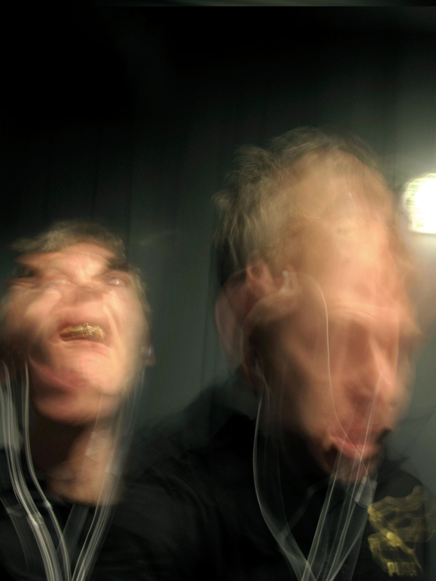
Over the course of an evening I am watching his face. He smiles, he relaxes, he shows disgust quickly, then laughs. There are so many things to keep track of. The next day I attempt to recall and I did not, as I had wished, see amalgams but instead discreet moments. There appears to be no use for the amalgamated image in recall. Perhaps this is the reason I am making the amalgamated portrait. It is an image that does not exist for me internally.
— Notes taken by Kristan Horton during production.
Ever flailed your head back-and-forth in front of the camera to catch a blurry selfie? Of course you have. We’ve all captured head-shots of seemingly maddened selves. Kristan Horton’s self-portraits are high-end versions of the blurred selfie … peppered with existential inquiry.
For his series One For Yourself, Horton faces the troubled relationship time and photography head on. Horton says a single photo is too hard to trust, so his animalistic portraits are made by combining multiple images.
“The document is never enough,” says Horton who’s discontent borders paranoia. “I need multiple perspectives to lessen an inner feeling of distrust. I think that’s why I get involved with duration.”
How can a single frame suffice? What about everything outside of the frame? What about the moment just before? Or just after? Horton prints out hundreds of images and as he flicks through the stack, configurations and blobs catch his eye.
“I’m trying to find the parts that match up and I combine them producing a neocubist portrait,” says Horton. “It was important to arrive at a result that was definitive. I keep using the word ‘solid’ [to describe the portraits]. These are heavily worked over — there’s evidence of long hours of careful collage, and yet they appear as very spontaneous things.”


Photographs are often mistaken as some sort of mirror to truth. Yet, they are static and we’re interminably moving away from every photograph ever taken; photographs don’t come close to describing the physical reality of our world. Horton’s amalgamation of image files tears each photo from its single moment in time. He uses image files as indistinguishable part of a larger artistic statement that collapses, attacks and interrogates time.
If you think of the work as navel-gazing, it’s probably because it is informed in some way by Horton’s fascination with the immediate and the everyday.
In 2010, Horton won the Grange Prize for his composite images of stacked materials in his studio. Then, I applauded the award. Horton has habitually sought to work with what is close.
“Since I’m usually living in the studio, it’s often the material of daily life,” says Horton. “Through these materials my observation and my preoccupations leak.”
The approach came undone, however, when Horton was an artist in residence in the remote west of Ireland.
“The studio was empty and at first this was disconcerting,” explains Horton. “Finally, I thought ‘If there’s nothing to work with then that’s the work.’ That’s when I grabbed the camera and took a shot of myself in this zero condition. In a sense, my reflexes kicked in and I designated myself as the raw material.”


From the solitary studio, Horton went on to make work on the subway in Berlin, in a backyard in Ireland, a kitchen in Canada. Wherever. Whenever. He makes portraits of others too.
The ease with which Horton fired off a hundred shots contrasts to the hard slog in post-production. The relationship of parts is not unlike cells used in drawn animation says Horton.
“A stack of clear sheets with parts of the character on each sheet,” he describes. “Looking at it from the top you just see the character together. I’m looking through the stack and trying to find where moments in time fit together.”
Fascinated by Kurt Vonnegut’s characters the Tralfamadorians who exist outside of time and by the early science fiction stories of Ray Cummings, Horton is wondering what it is to get beyond, outside of, or on top of time. He knows it’s a fruitless charge but the effort and discovery involved in pushing photography toward an impossible premise is reward enough.
“The combinations of images are without an end. To feel any kind of satisfaction under this condition I have to at least engage, and to engage until exhaustion.” he says. “Not exhausting the subject, but exhausting yourself; an exhaustive attempt to stay in step with the complexity.”
The tortured results bare resemblance to Francis Bacon paintings. A comparison Horton is quite happy with.
“Bacon once said, ‘Technique is always dissolving. The technique of recording has to all the time be remade. It’s like a continuous invention to record a fact.’ I feel the same way,” explains Horton. “I was just trying to satisfy thoughts about a state, and the result ended up looking like something out of Bacon’s oeuvre. It didn’t upset me to arrive at that.”
And the title, One For Yourself? How did he arrive at that. Sat at a Berlin Hotel Bar, Horton explained to a fellow drinker that he was working on a project that dealt with time and the self. The companion responded, ‘One for yourself, then.’
As a title, “it seemed sympathetic to the altered state of these portraits,” asserts Horton.
One For Yourself is about Horton, and of Horton, but the way it vies with the prevalence of single-shot selfies, it might just have technique for us to borrow in the description of our own time … and our own states.


BIOGRAPHY
Kristan Horton was born in Niagara Falls in 1971. He lives and works in Toronto. Horton uses a variety of media — including but not limited to photography — to elaborate on the ways in which movement is represented, and the ways in which things are generated and regenerated. Horton studied at Ontario College of Art and Design and the University of Guelph, where he received his MFA in 2007. Preoccupations since the 1990s include the consumption of texts and mass media, the representation of simultaneous and rotated scenes, and the visualization of power generation. Horton is well known for his photographic series Dr. Strangelove Dr. Strangelove (2003–2006), for which he recreated scenes of a Kubrick film using items from his studio. Recent photography is in a neo-cubist vein; for his 2009 series Orbits, Horton presented photos that layered multiple, rotated views of scenes from his studio. In 2010, Horton won the Art Gallery of Ontario’s Grange Prize for contemporary photography and was included in the National Gallery of Canada’s Canadian Biennial.


Anyone doing work about drone and drone policy that I’ve spoken to has, as some point in their research, relied on the information put out by the Bureau of Investigative Journalism (BIJ). When I wrote my piece Here’s What Drone Attacks in America Would Look Like for WIRED, BIJ was an invaluable resource, especially in providing solid figures for the numbers of drone strikes, deaths from those strikes, and specifically civilian deaths from those strikes.
BIJ’s good work continues, as it played host to the Forensic Architecture (Goldsmiths University, London) and SITU Research to produce an online interactive WHERE THE DRONES STRIKE.
With WHERE THE DRONES STRIKE which we can examine drone target types (vehicles; religious; other; domestic; unclear target). Was that an insurgent training camp that was annihilated or was it a marriage celebration full of women and children?
Due to secrecy at the Pentagon (and previously at the CIA, when it controlled the drone program), reliable information on drone attacks is very difficult to come by.
“The CIA has been bombing Pakistan’s tribal agencies with drones since June 2004. In the early years, strikes were rare. But from mid-2008 onward the frequency of strikes increased, peaking in 2010. That year, 128 strikes killed at least 751 people – of whom 84 were civilians. There were 23 strikes in September 2010 alone – the most intense month yet recorded by the Bureau,” say the BIJ.
BIJ routinely collects info on drone strikes through thousands of reports, witness testimonies and on-the-ground data from Pakistan, but this is the first time this data has been put rendered as an interactive to propel human rights and accountability.
“The map demonstrates how the frequency of strikes – and the overall reported casualties – has changed over time. It also shows how the targets of the strikes have changed,” explains BIJ. “Domestic buildings have been the most frequently hit target type in each year of the drone war. Attacks on vehicles have become gradually more frequent, and in 2011 almost as many vehicles were hit per strike, on average, as buildings. But this dropped from a peak that year and in 2013 drones targeted vehicles just three times. Attacks on vehicles tend to kill fewer people than attacks on domestic buildings, and fewer civilians. The highest death tolls of all are in the comparatively rare attacks on madrassas and mosques.”
The U.S. dropped it’s first bomb from a drone in late 2002, on Yemen. The Obama Administration only formally acknowledged it was flying killer robots over foreign lands in 2012.
Go to www.WHERETHEDRONESSTRIKE.com
For a wild editorial break down of the data (and more graphs!) read the BIJ’s report Most US Drone Strikes In Pakistan Attack Houses which accompanied last week’s release of WHERE THE DRONES STRIKE.
For regular updates on drones at home and abroad, may I recommend following the Drone Weekly Roundup and signing up for the Newsletter (scroll down) put out by the Center For The Study Of The Drone at Bard.
Update 05.11.2014: The Eventbrite registration page has been closed after 80 sign-ups. But, there’s space for walk-ins and allcomers. We don’t want to turn anyone away!
Email info@asocialpractice.com to extend your interest. Thanks.
A BIG PUBLIC CHAT
Next Friday, May 16th, as part of the Open Engagement conference, I’ll be part of a conversation about photography based art and social practice.
![]()
The Photo-Based Social Practice panel and group brainstorming is at the Aperture Gallery in New York, 10am – 12 noon.
Moderator Eliza Gregory along with panelists Gemma-Rose Turnbull, Mark Strandquist, Wendy Ewald and I will be discussing socially engaged, transdisciplinary, and expanded practices in contemporary photography.
Highfalutin, huh? Not really. The language is big, but the query is simple. Can photography build community and empower subjects? How can photography be nice?
It’s free, but preregistration is required. Do that HERE (6th option on the list).
We’re only going to do the briefest of introductions to our work before breaking into groups to tackle a host of questions that deal with audience, relevance and good design. It only makes sense that we collaborate to tackle answers to these issues.

We hope that the panel will follow nicely on from December’s Collaboration: Revisiting the History of Photography event that crowdsourced a new timeline of photo-history by focusing on projects with communities and groups as creators. I love the ideas involved in that.
While the Collaboration: Revisiting the History of Photography event gave new recognition to old projects and while it presented a new timeline and framework, it didn’t tackle best practices. From the projects it unearthed we can surmise the nature of some socially responsible projects, methodologies and motivations. In our discussion next week we hope to extend the conversation further and start to define common language, and potentially best practices, for socially engaged photography projects.
Please join us and help us along!
LOCATION, DATE, TIME
Aperture Gallery and Bookstore
547 West 27th Street, New York
10:00 am – 12:00 pm, Friday, May 16th.
FREE WITH REGISTRATION
NEW VENTURE! ‘PHOTOGRAPHY AS A SOCIAL PRACTICE’
Now is a good time to mention a joint venture recently started by my fellow panelists, Eliza Gregory, Gemma-Rose Turnbull and Mark Strandquist.
Photography As A Social Practice is a website for reference tools, teaching tools, and conversation about the intersection of social practice and photography. I’ll be contributing every so often and chatting on the phone about content. You can suggest resources by emailing info[at]asocialpractice[dot]com
SPONSORS
The panel is offered in conjunction with the Magnum Foundation and the Aperture Foundation who combined to publish Documentary, Expanded, the Spring Issue (#214) of Aperture Magazine as part of the Photography, Expanded initiative. Support also comes from the Open Society Documentary Photography Project, The School of Journalism and Communication (University of Queensland) and Portland State University‘s Art and Social Practice Program.
OPEN ENGAGEMENT, 2014
The Photo-Based Social Practice panel is part of Open Engagement, an international conference that sets out to explore various perspectives on art and social practice, and expand the dialogue around socially engaged art-making. This year, the conference addresses the theme of Life/Work. It is 2 days of programming (Sat, May 17 – Sun, May 18) at the Queens Museum, plus 1 day of pre-conference events on Fri 16th at different locations around the New York boroughs.

I never expected to make comment on the career of Miley Cyrus here on the blog, but then again, I never expected to come across the greatest sketch of Miley Cyrus ever made.
The drawing, titled Miley Twerking, was made by my friend Christian Nagler. It originally appeared in the Fall 2013 Issue of Actually People Quarterly (APQ), an indie print publication based in San Francisco. APQ and Nagler kindly provided permission to share the picture.
There’s not a day that goes by that I don’t see a thumbnail image of Miley Cyrus in the sidebar of some website. Collections of Cyrus-resembling pixels are ubiquitous. In terms of describing Miley-Cyrus-the-person, a photograph is almost meaningless. In terms of describing Miley Cyrus-the-product, a photograph is the perfect hype-spinning money-making tool.
The reason I like Nagler’s sketch so much is that skewers the ridiculous theatre of her MTV Awards twerking AND undermines the grotesque image-driven publicity machine that surrounds her. It lays bare what she is and discards the useless debate of who she is.
Cyrus is, as with all celebrities, almost unknowable. She is not a person, but a product. She is no longer a who, but a what. Photography when it encounters celebrity elevates and promotes the what. Photography may purport to depict the who, but it does not.
This is my reading and not necessarily Nagler’s intent. I think he is genuinely interested in Cyrus; perplexed by the who, the what, and the gap between.
“The reason I think Christian’s picture is amazing is because it leaves space left open,” says APQ founder and editor, Sarah Fontaine. “It doesn’t totally proscribe an opinion on her. There’s a level of investment. A drawing takes time but a photo takes an instant.”
If I could even know Cyrus, I don’t think I’d dislike her. Everyone wants to have an opinion about Cyrus’ conduct. Some think her various states of undress hinder the movement of our culture toward one of gender equality. Often Cyrus is the focus of vitriol and frustration, but perhaps we should be looking at society as a whole? I’ll defer to Gloria Steinem and suggest we hate the game, not the player.
“I think that we need to change the culture, not blame the people that are playing the only game that exists,” said Steinem.
Photography upholds, forwards and fortifies the game. Nagler’s sketch respectfully questions the game. My thoughts on photographing Miley Cyrus? Don’t.

Kansas, MO and Brooklyn, NY based artist Jaimie Warren is the recipient of the 2014 Baum Award for an Emerging American Photographer. This is a curious selection for many reasons — all of them good.
Firstly, I wasn’t aware of Warren’s practice; even though she has a Wikipedia page and a long history with VICE, I had not come across Warren’s work before. I am glad I did.
Secondly, her work is wacky. The meanings of her images are elusive and you’ve got work hard with them. As many photographic artists do, Warren plays with ideas of fantasy, fun, performance and artifice, but she does so in much more aggressive, brazen way. These are not the cool, clinical images of studio assemblages we see from many young (MFA-bearing) image-makers.


I really, really enjoy Warren’s disfigured portraits and tableaus. They’re pop, they’re a bit grotesque, they cinch perfectly into the shock-visuals of audiences habituated to the Tumblr-driven flow of images. Warren’s work is Peewee Herman meets Carnivale meets that bonkers Halloween party you went to in 1997.
Thirdly, it is great to see an award go to a photographer who isn’t just a photographer. For all the intelligent image detournement in her work, Warren is not operating from a fine art ivory tower. Quite the opposite. Central to Warren’s work is constant collaboration with communities. Her main vehicle for making art is the non-profit community arts initiative Whoop Dee Doo.
Whoop Dee Doo works with communities “to create unique and memorable events that challenge the everyday art venue or community event.” Everything from concept to end product is intended to fit the needs of host communities, and all acts are “truly inclusive endeavors that celebrate differences and unabashed self-expression.”
Probably the best and quickest way to get a handle on the art and performances is to view the Whoop Dee Doo Vimeo Channel.
Whoop Dee Doo has worked with youth programs including Caldera Arts (Portland/Sisters, OR), Operation Breakthrough (Kansas City), the Boys & Girls Club (Kansas City), Big Brother/Big Sister (Kansas City), Girls, Inc. (Omaha, NE), Experimental Station’s Blackstone Bicycle youth Program (Chicago, IL), Urgent, Inc. and the Rites of Passage Program (Miami, FL), Muse 360 and 901 arts (Baltimore, MD), as well as college interns at the University of Central Missouri, Pacific Northwest College of Art, the Kansas City Art Institute, the University of Chicago, Maryland Institute College of Art, Rockhurst University, and the Pennsylvania Academy of Fine Arts.
Impressive.

Jaimie Warren, Self-portrait as Bulls fan in La Jeunesse de Bacchus by William-Adolphe Bouguereau/Michael Jordan basketball painting by dosysod of the Independents, 2012.

Jaimie Warren, Self-portrait as Nun with some of my Mother’s Favorite Famous People in the Forerunners of Christ with Saints and Martyrs of the Fiesole San Domenico Altarpiece by Fra Angelic, 2014.
From looking over the portfolios, I reckon the folky-rainbow-eclecticism of Warren and her collaborators’ work reflects something close to common feeling. What else could there by except fun, wild variance and complexity when the hands of dozens go into making something?
Breaking down stereotypes and barriers between age, gender, culture and sub-culture is one of Whoop Dee Doo‘s main objectives. The group is open to designing performances and workshops “between unlikely pairings of community members that ultimately blossom into exceptional and meaningful interactions.”
A lot of the time, the use and outcomes of awards can be hard to pin down, but I can’t imagine it’ll be too long before Warren is putting the $10,000 to use making more happenings with communities. Because she always has. Let the merriment continue.


BAUM AWARD
The Baum Award for An Emerging American Photographer is a project established out of the conviction that photography is a powerfully influential medium with the capacity to emotionally connect with audiences in ways that words cannot. This ability to reach people on a visceral level can transform awareness to understanding and lead interest into action – fundamental aspects of a healthy and vital society.
Click here to see previous Baum Award winners.
SIGN OF THE TIMES
Andres Serrano has just released Sign Of The Times a new body of work for which he bought signs from the homeless in New York at $20 a pop. Over 200 signs in total.
I’m not sure about the sound track to the video, but Serrano’s words are worth a read on the Creative Time Reports website. He doesn’t breaking any new rhetorical ground but he does make a good case for this work being a timely statement to coincide with the end of Bloomberg’s stint as city mayor. New York has a problem with homelessness.
Just once, Serrano’s words veer dangerously close to over-analysis and sentimentality:
“What struck me about the people who sold me their signs was their willingness to let go of them. It was as if they had little attachment to them even though some signs had been with them for a long time. Of course, they needed the money. Many people would tell me they had made nothing that day. But I also think that those who possess little have less attachment to material things. They know what it’s like to live with less.” [My bolding.]
But, ultimately, he grounds the work where it should be — in an it-is-what-it-is conclusion about art, and in an it-is-an-outrage statement about society:
“Although the homeless are at the bottom of the economic ladder, many Americans are not far from it. They may not be homeless, but they’re poor. Fifty million or more Americans live at or below the poverty line.”
You’ll recognise the name. Serrano brought us the *controversial* Piss Christ and in doing so exposed the small-minded vitriol of the culture wars in eighties America, that set the tone for the rightwing unthink so common today.
Despite their wildly different methodologies, Piss Christ and Sign Of The Times have a lot in common. The former magnifies the cultural differences and the latter magnifies our economic differences. Cultural and economic capital are related. Both works ask audiences about how far they, we, are willing to go to manage perspective and to get out of ones own head. Both artworks create, very efficiently, the parameters to those urgent discussions.
Sign Of The Times is a very simple project. It’s not a subversion of capitalism; in fact barter-and-trade might be one of capitalism’s purest forms!? Regardless, Serrano made small but significant one-off contributions to the lives of hundreds of homeless during the making of the work. Hopefully, the presentation of Sign Of The Times will shape public and political opinion to improve the lot for many more homeless folk?

At Photoville this year, you’ll find me and a team of pen-pushers in a container amassing The Depository Of Unwanted Photographs a crowdsourced archive of images and stories. We need your help and we need your submissions.
What is The Depository Of Unwanted Photographs?
The Depository Of Unwanted Photographs (TDOUP) is a few things: part social engagement, part fun, part an investigation of quality but mostly an opportunity to share our thoughts on how and what we think about our own photographs.
CURATORIAL STATEMENT
My explanation lifted straight from the The Depository Of Unwanted Photographs sparkly website of why I have conceived of TDOUP:
When asked to pick out a single image they absolutely treasure, people generally don’t hesitate. A snap of their children, a Polaroid of their parents, a formal pose from precious life event, or perhaps even a photograph with the prescribed artistic balance of composition, contrast and exposure. Whether the choice is dictated by emotional memory or technical concerns, the question “What is your best photo?” is not an unusual one.
But what about the question, “What is your worst photo?” To put it another way, what photograph of yours is obsolete, worthless, old news or just plain bad? Which single photograph of yours would you like to officially state on the record as unwanted?
During Photoville, submissions will be rotated in and out of display for public viewing. When the festival ends, the Photoville team will compile the images and create a reference book of “Unwanted Photographs”. The debate about what is good and bad in photography is as old as the medium itself, but what are the debate’s current touchstones? If we’re looking for good photography, we’ll find plenty of suitors in photobooks, galleries and publication, but where do we find a legitimate and well-researched presentation of bad photography? Does our discussion of what is good not also rely on a shared knowledge of what is bad, unwanted and unloved? Images do not exist in a vacuum, but emerge from contexts and histories. We think that your photos and stories are as relevant as the stories in news-photo exclusives and famous documentary images — your stories are central to discussions about how we consume and use photography. Therefore, we ask that each submitted image is accompanied by 50+ words on why it is not wanted by you, and not needed in the world.
We create and circulate millions of images every week. Many of these never exist beyond digital formats; stuck in our phones or transferred to computers on their way to social media sites. We are constantly employing choices, consciously and subconsciously, to share or overlook images. If we accept the mantra that ‘we are all photographers’ then aren’t we all photo-editors too?
There might be many of your images that you could trash, but by asking you to choose only one, we hope you’ll take the opportunity to think about the proliferation of images in society and your relationship to the ever-increasing number. Photoville will officially recognize your image as Unwanted with a numbered certificate and unique catalogue code. One-by-one, as the images interrelate and build the Depository, new meanings will emerge. The arbitrary definitions brought to the project by you the public will amount to a unique view. The Depository Of Unwanted Photographs is an unpredictable interrogation of quality that crucially is made by the public, not by the dominant voices of those in the media or culture industries.
HOW TO SUBMIT YOUR UNWANTED PHOTOGRAPH
During Photoville, you may make walk-in submissions at the TDOUP container which will be equipped with a scanner and computer to download, copy and catalogue your printed photographs and digital files.
For those of you who are unable to attend the event:
– Download the form (PDF)
– Attach a photograph and fill out the form
– Return the form for processing. You may either:
A. Scan the form and email it to receivables@unwantedphotographs.org
B. Place it in an envelope and mail it to 111 Front Street, Suite 204 – Brooklyn, NY 11201, USA
SHARING IS GOOD: #TDOUP
Please share the project and the www.unwantedphotographs.org URL far and wide. Please send us your jpeg and share your story.
Please use Facebook, Twitter and Instagram to hashtag your thoughts, observations and photos. We are #TDOUP
See you in NYC on Thursday!

Delivered with some gusto, Cornell West explains why the use of Martin Luther King’s bible during President Obama’s inauguration was ill-advised.
Obama might be trying to fix economic inequality in free society, but West brings up at the half way point the role that the prison industrial complex has in punishing the poor.
Furthermore, the Obama administrations expanding drone program and the crimes against humanity in Iraq, Pakistan, Afghanistan and Guantanamo means Obama can not legitimately claim to be a righteous inheritor of MLK’s non-violent message.
What do you think? Was the use of MLK’s bible clumsy? Worse? Conceited? Obama has always been cast as a sharp-minded fellow, able to see beyond platitudes and any entourage of yes-men, but perhaps Obama and his inner-circle have started to believe their own hype?
What would people have said if George W. Bush had asked to lay his hand on MLK’s bible during his inauguration? He and Obama fought and are fighting the same wars abroad.
